

Brand identity for a new nutritional healthy drink based in Doha, Qatar.
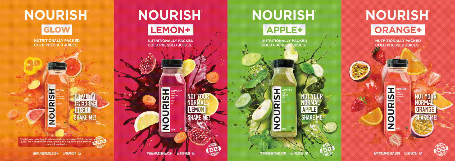
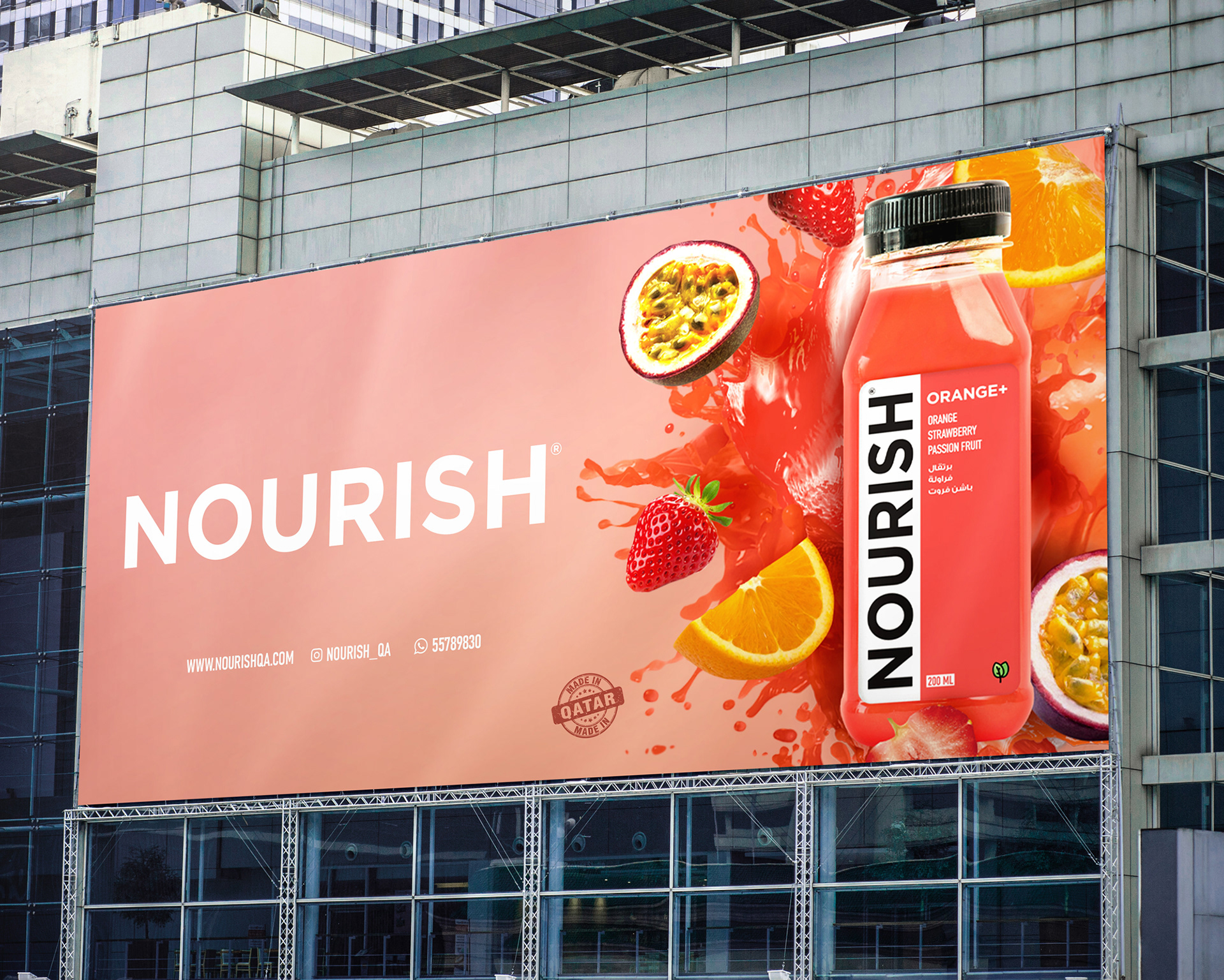
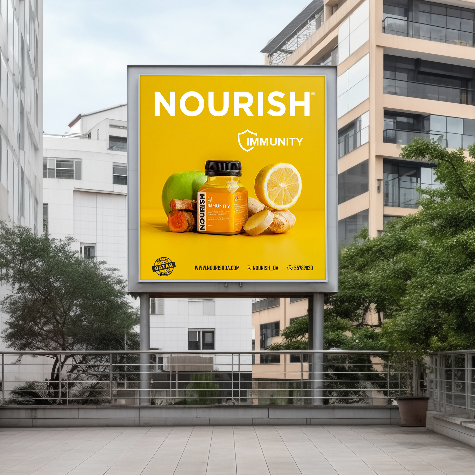
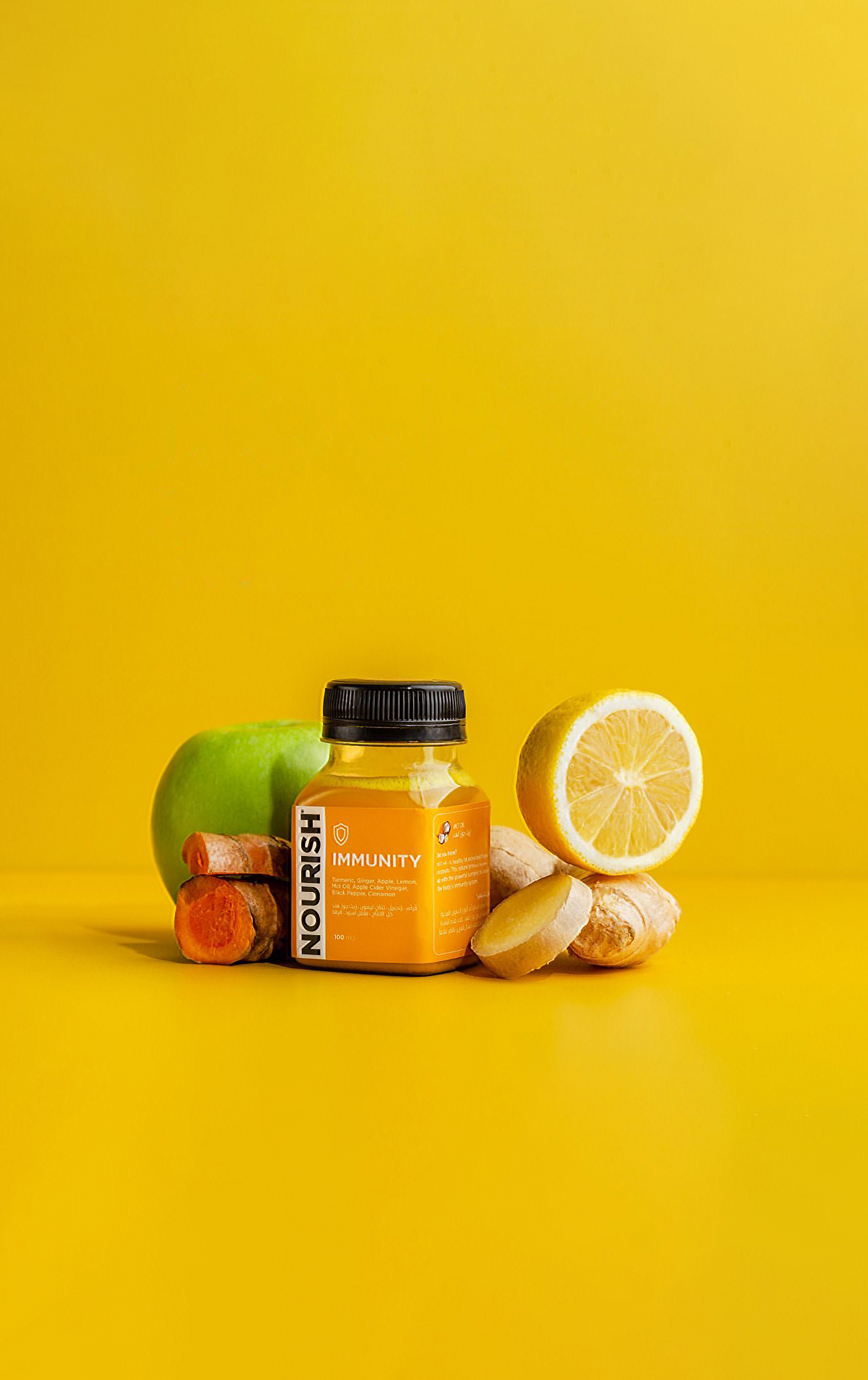
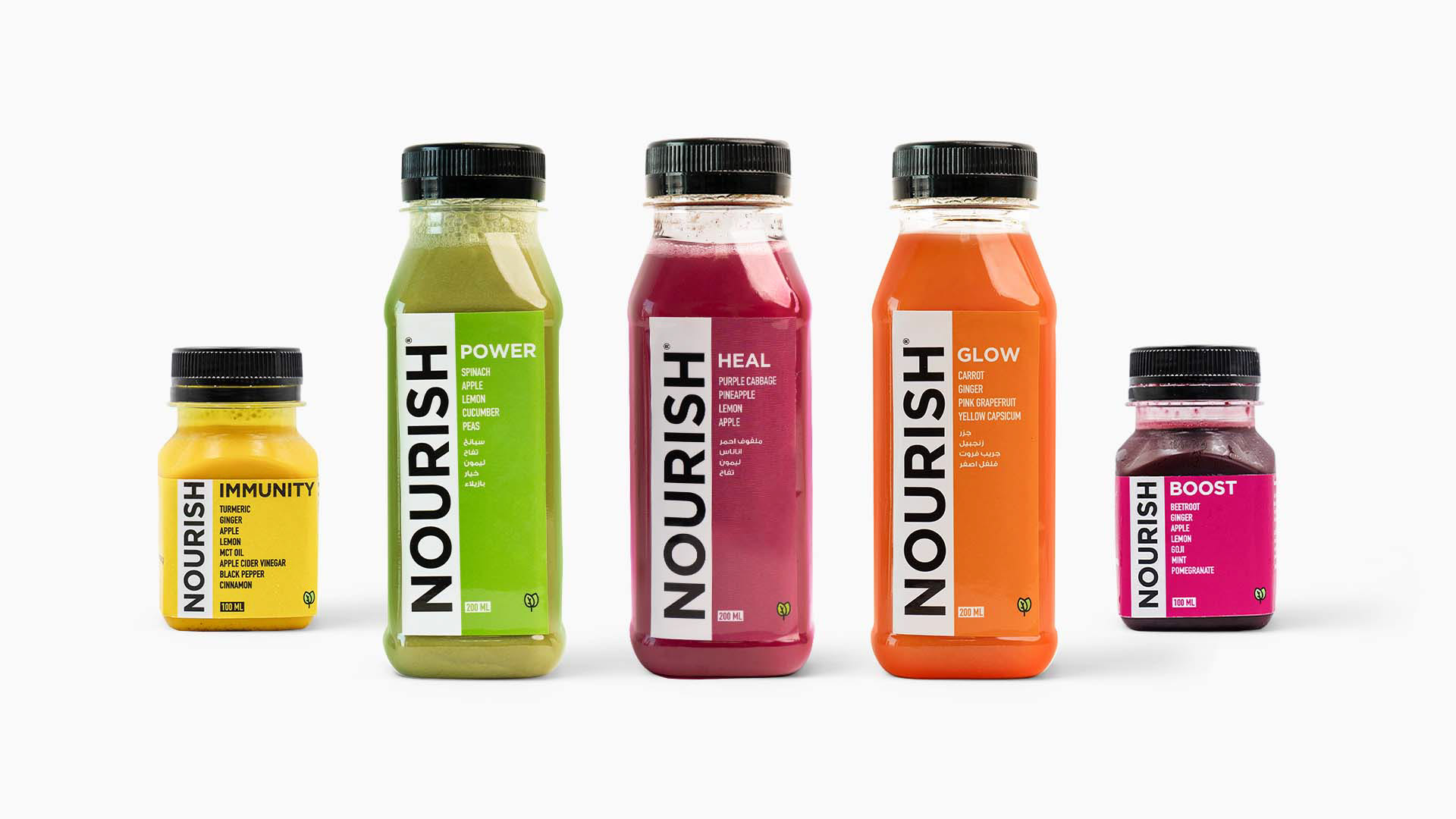
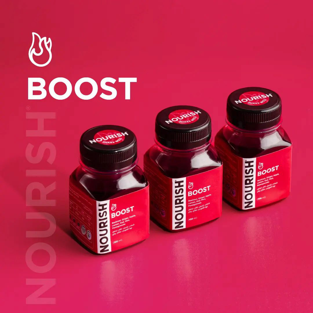
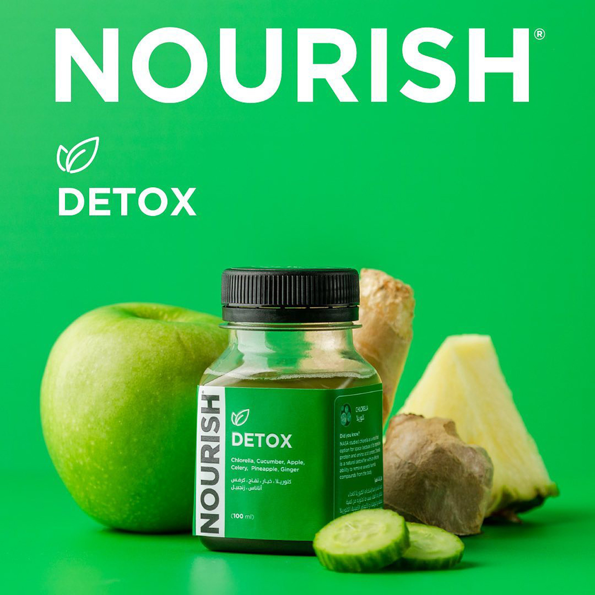
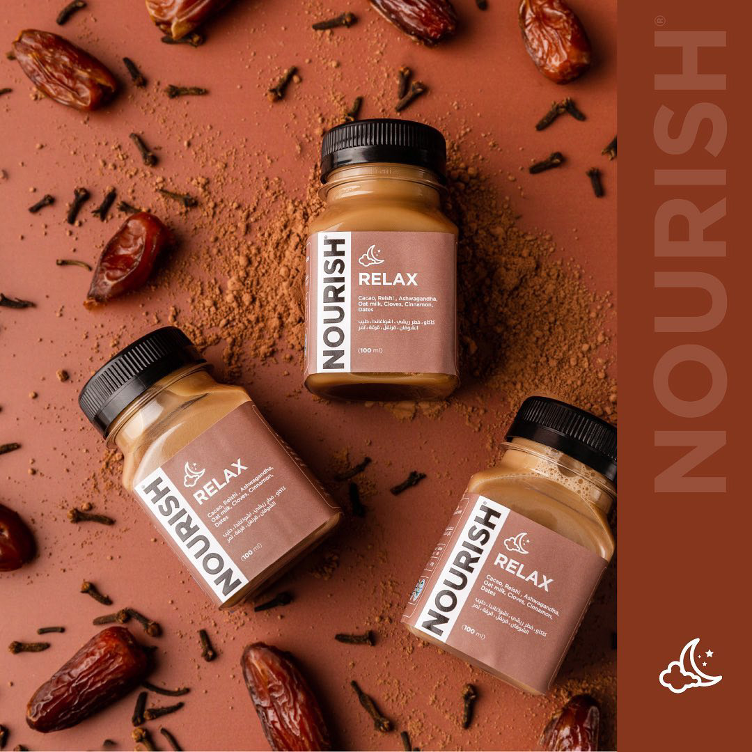
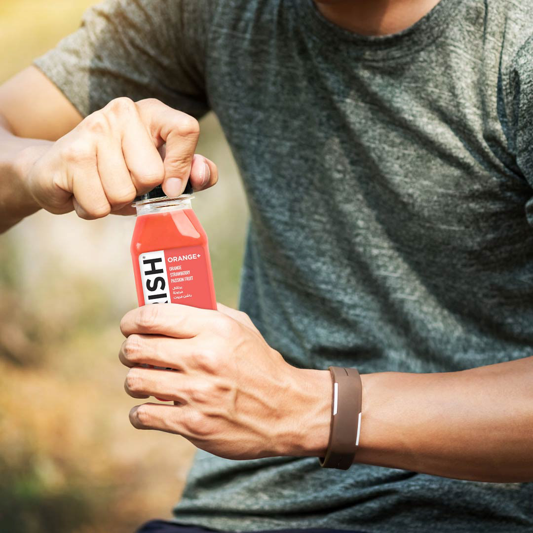
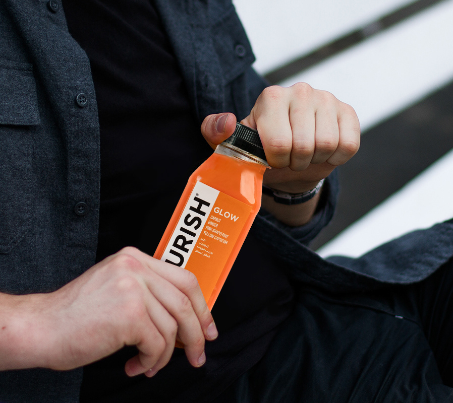
NOURISH juices are carefully crafted by their in-house nutritionists to capture the natural health benefits. They use only the freshest, most flavorful vegetables, which are cold-pressed and slowly squeezed to extract the maximum goodness in every drink.
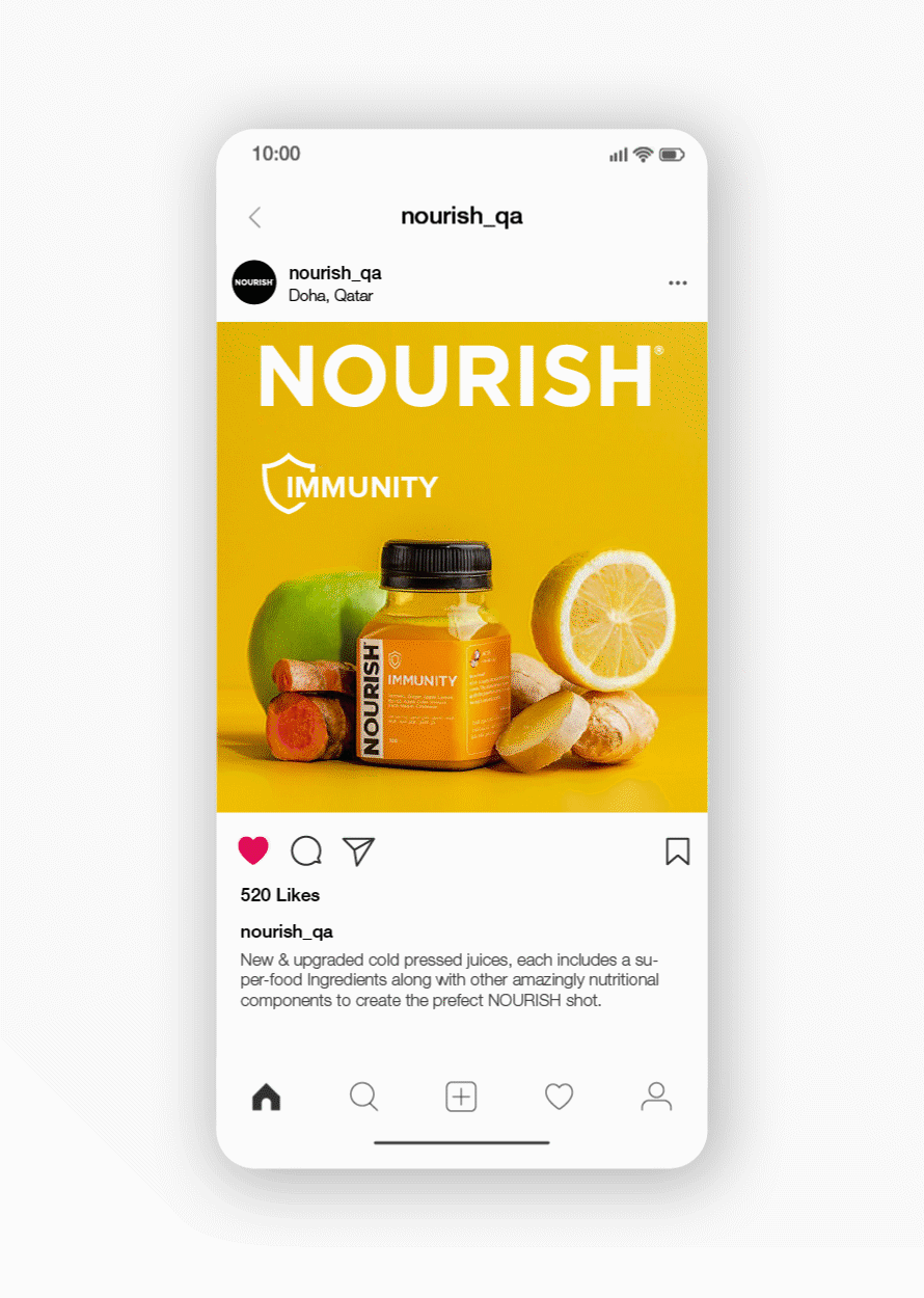
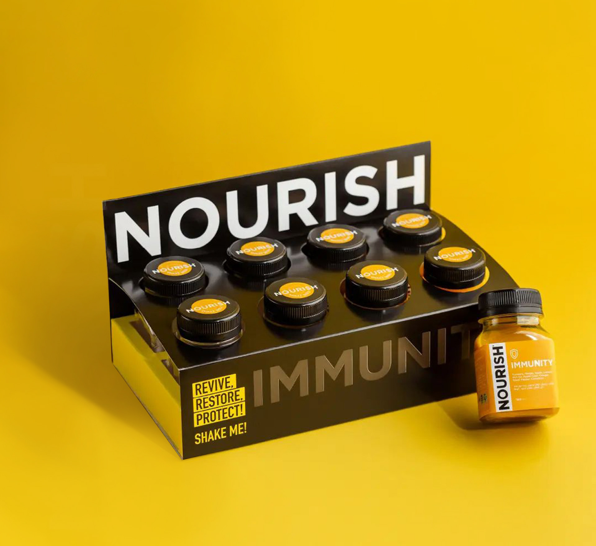
NOURISH is dedicated to prioritising nutrition and aims to motivate others to adopt a healthy lifestyle by making #NOURISH a #HEALTHYHABIT. To preserve the essential nutrients in each bottle, they employ high-pressure processing (HPP).
NOURISH aims to establish a unique brand identity in a competitive market, distinct from conventional approaches. The objective is to revitalize the brand's assets and effectively communicate compelling stories with credibility, emphasizing the core message.
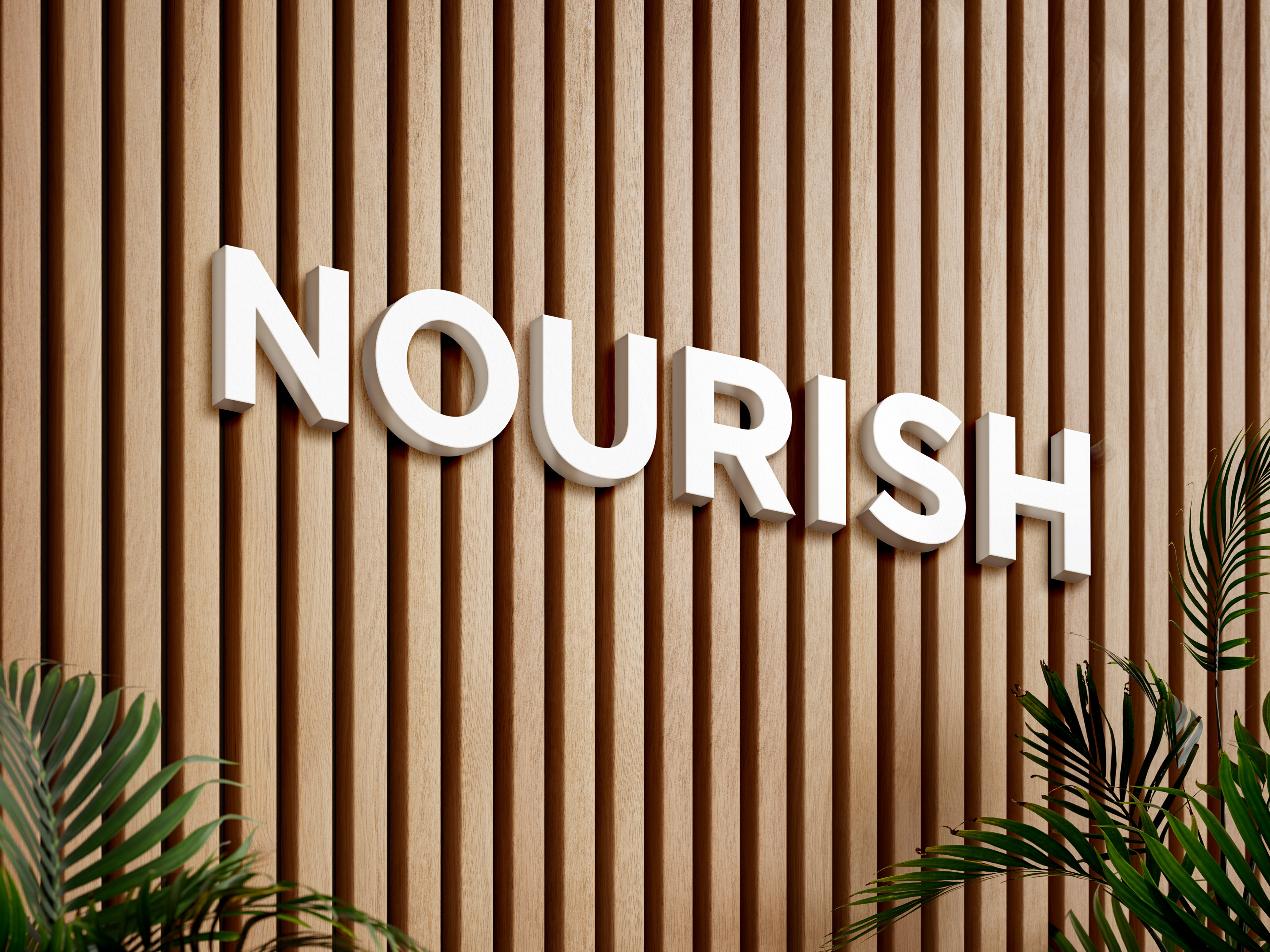
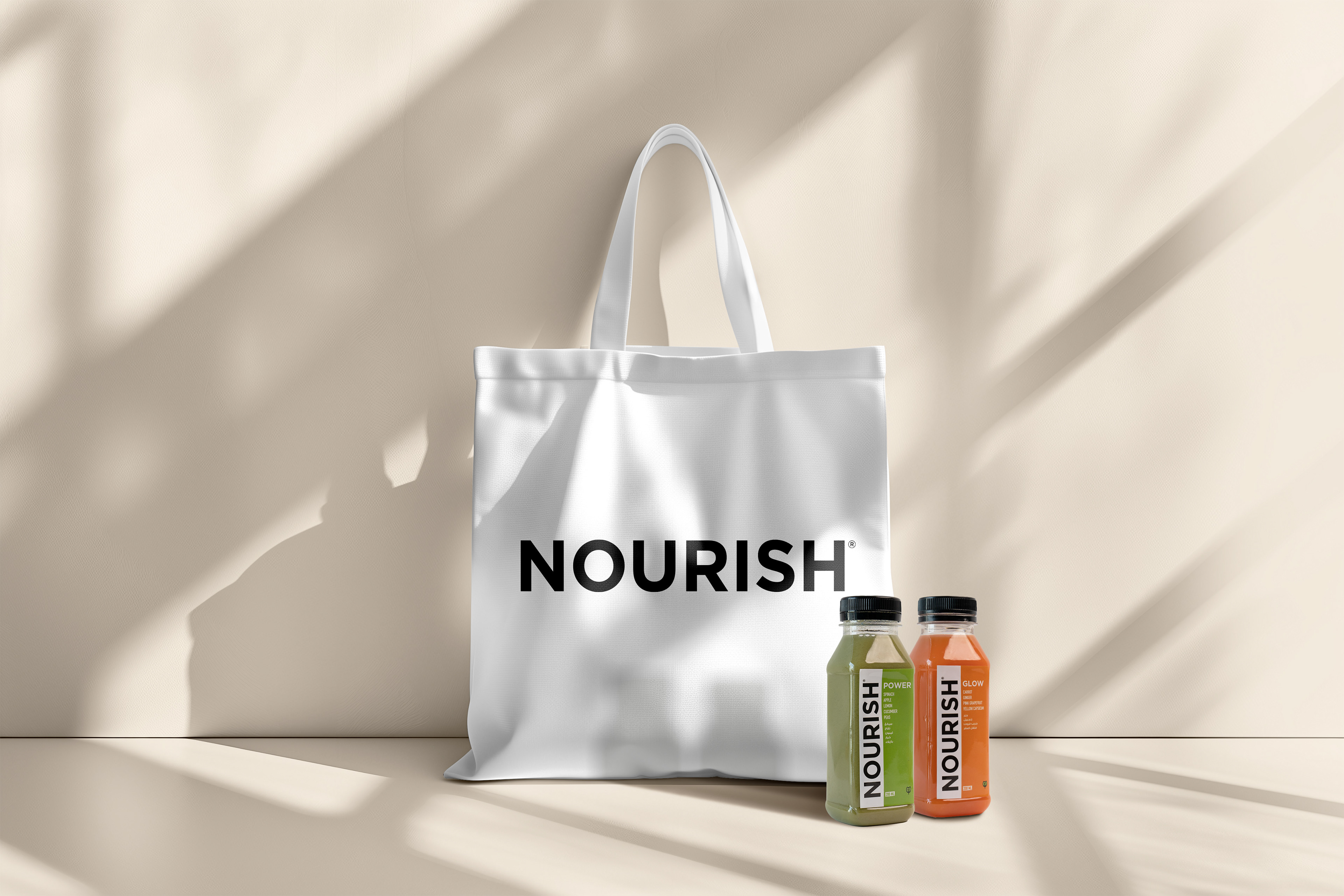
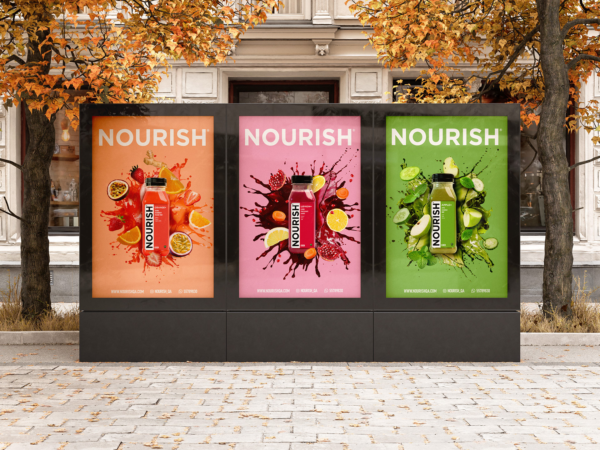
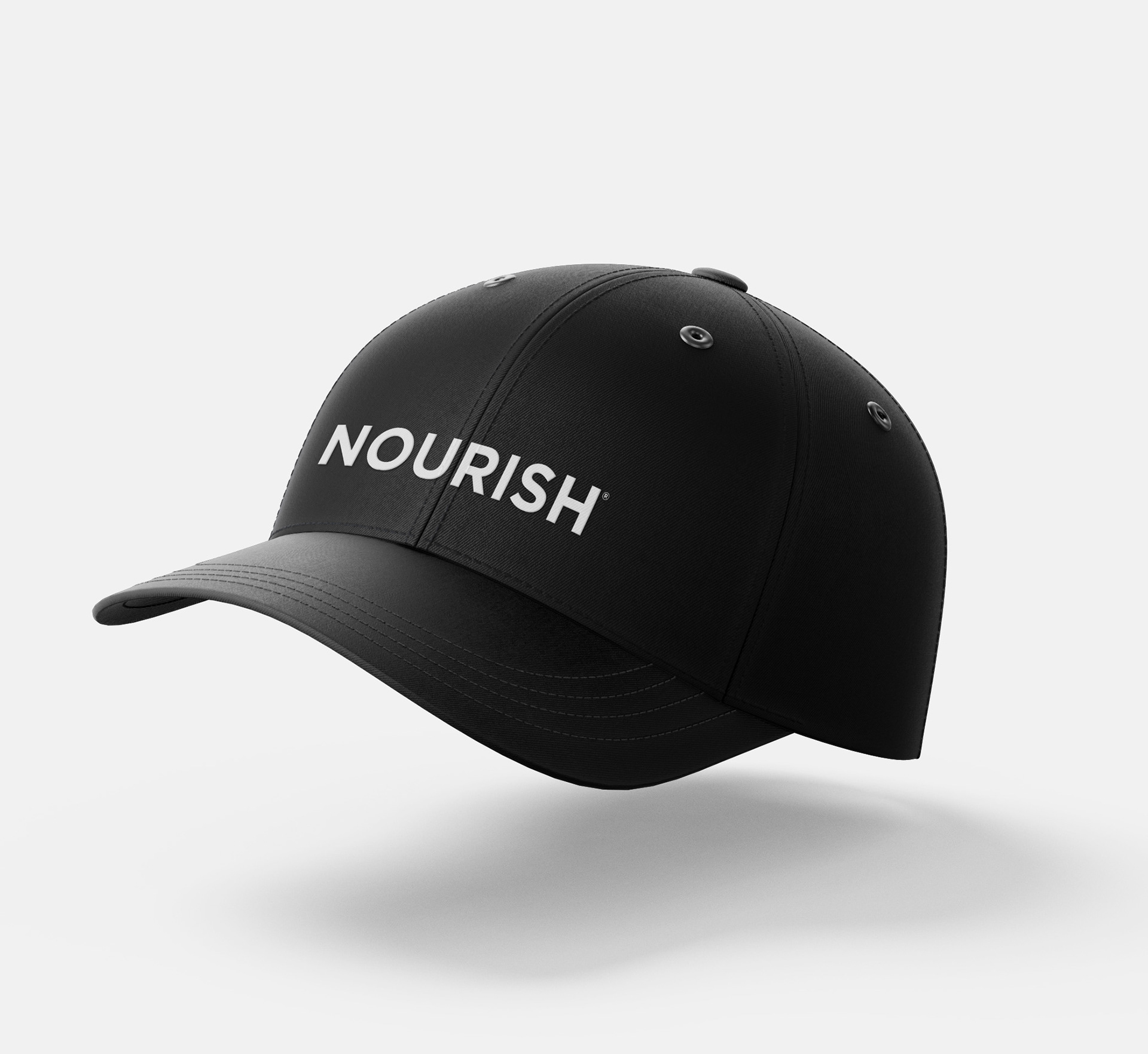
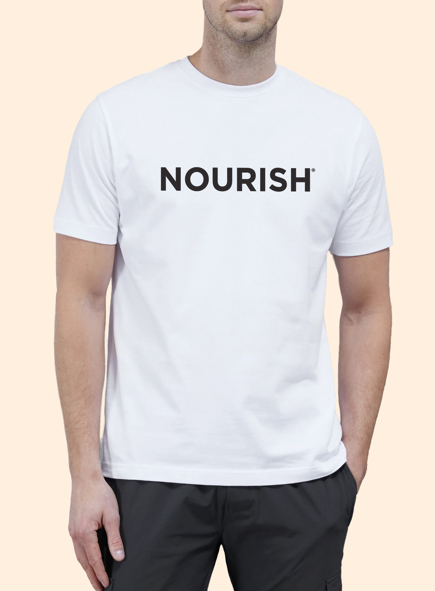
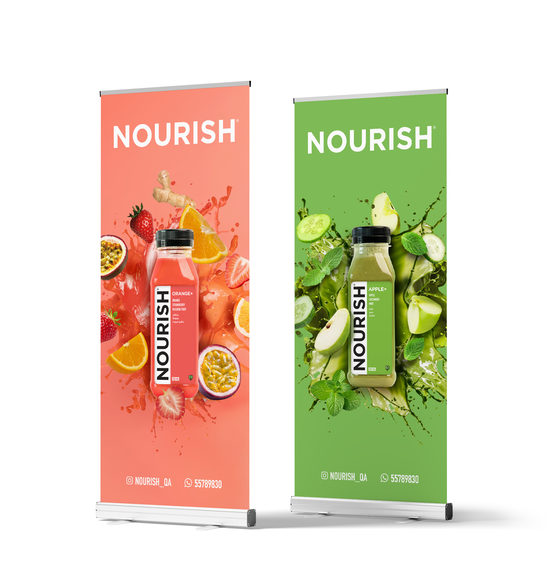
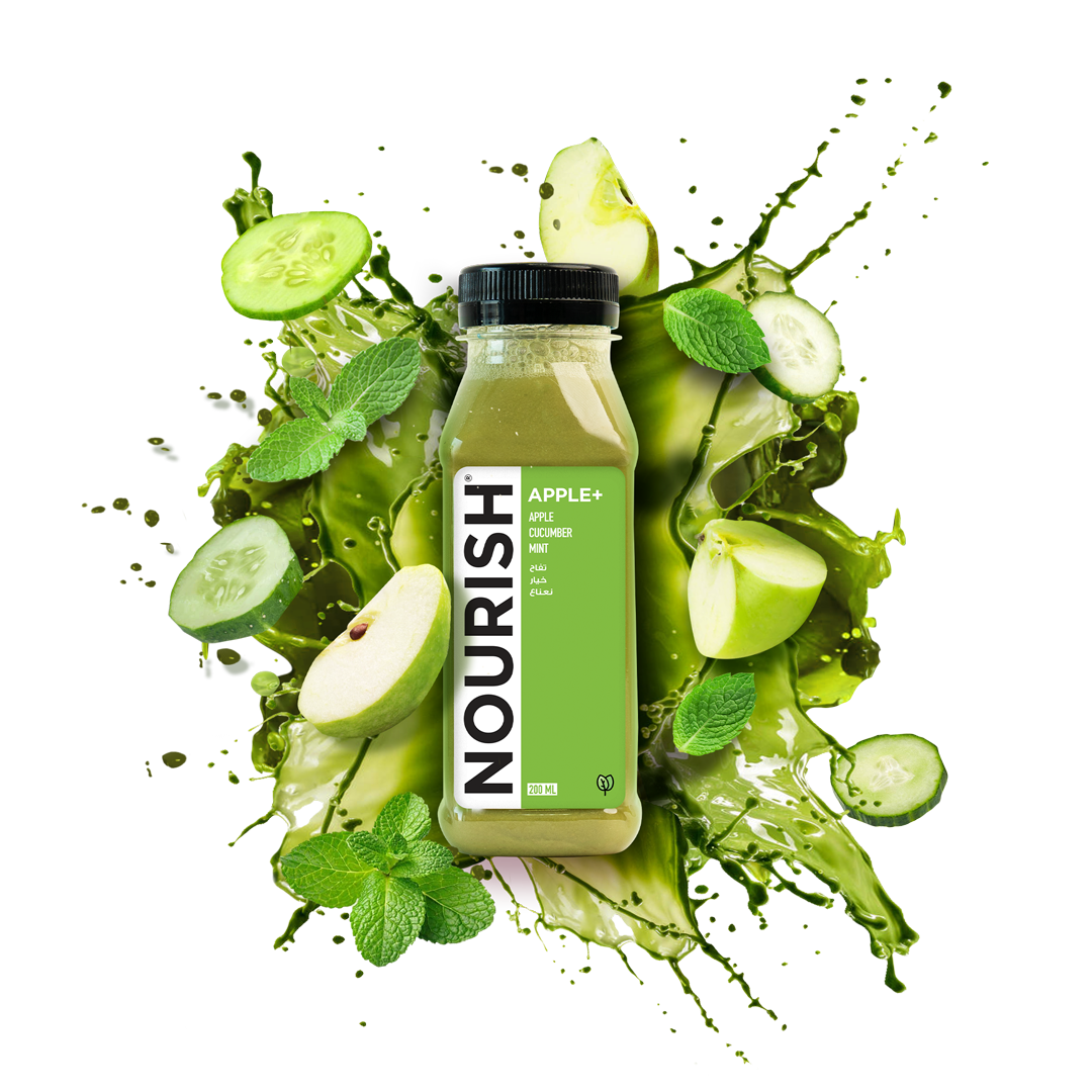
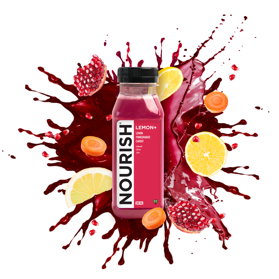
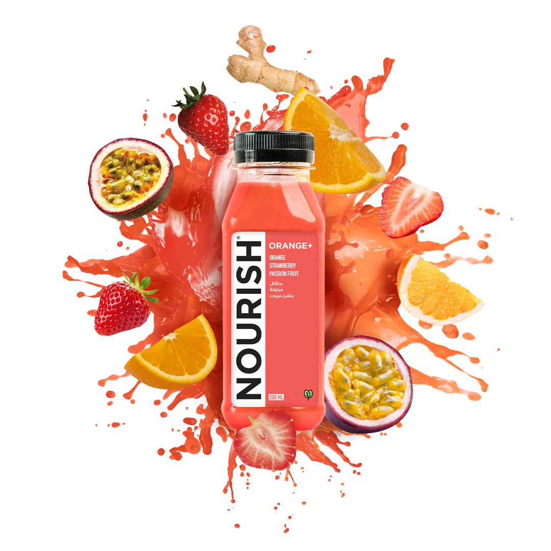
The eye-catching and bold NOURISH logo perfectly represents the essence of the brand, providing outstanding experiences and pleasant surprises with every sip for their valued customers. I took a more daring approach with the design and color scheme, using a vibrant accent color for each juice shot in the collection.
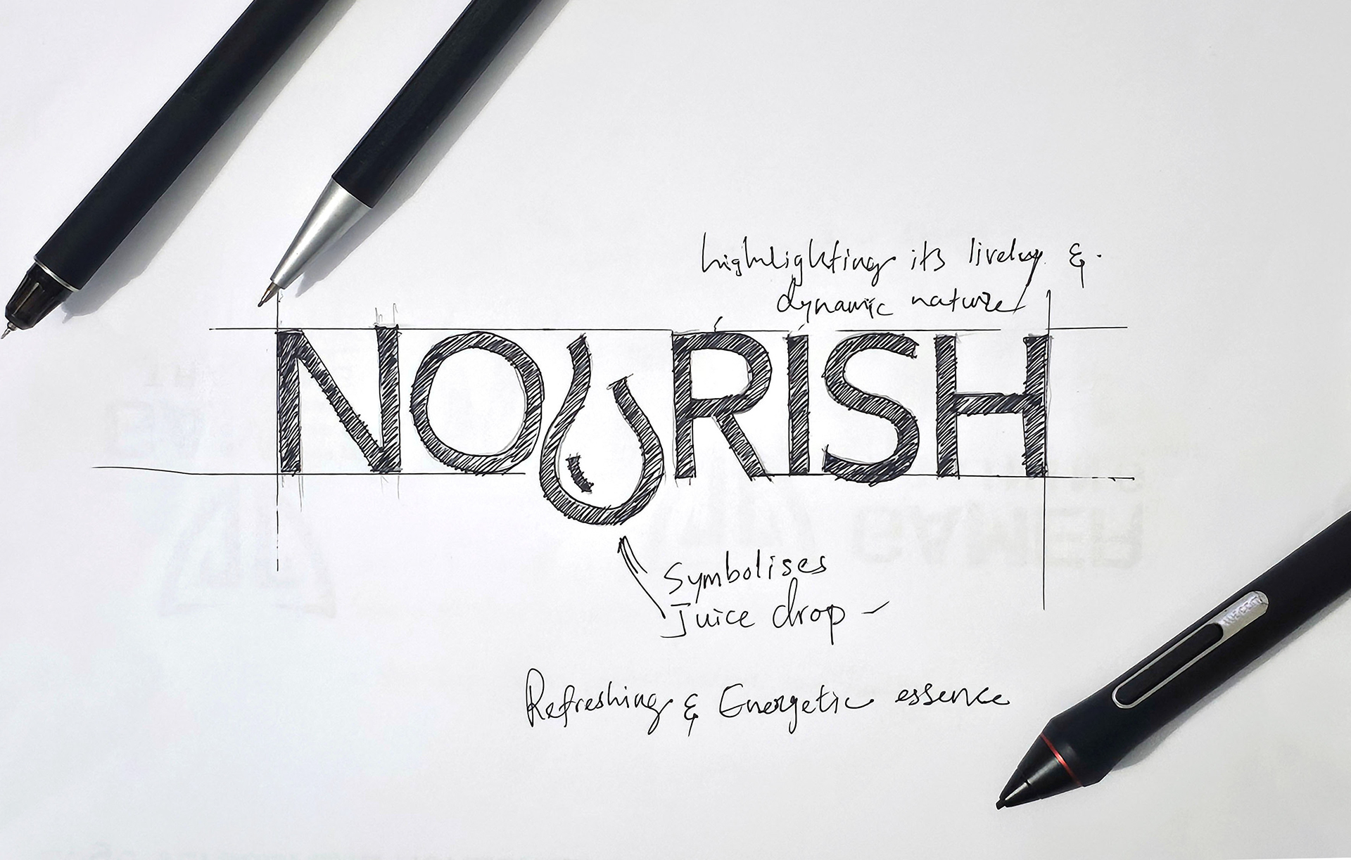
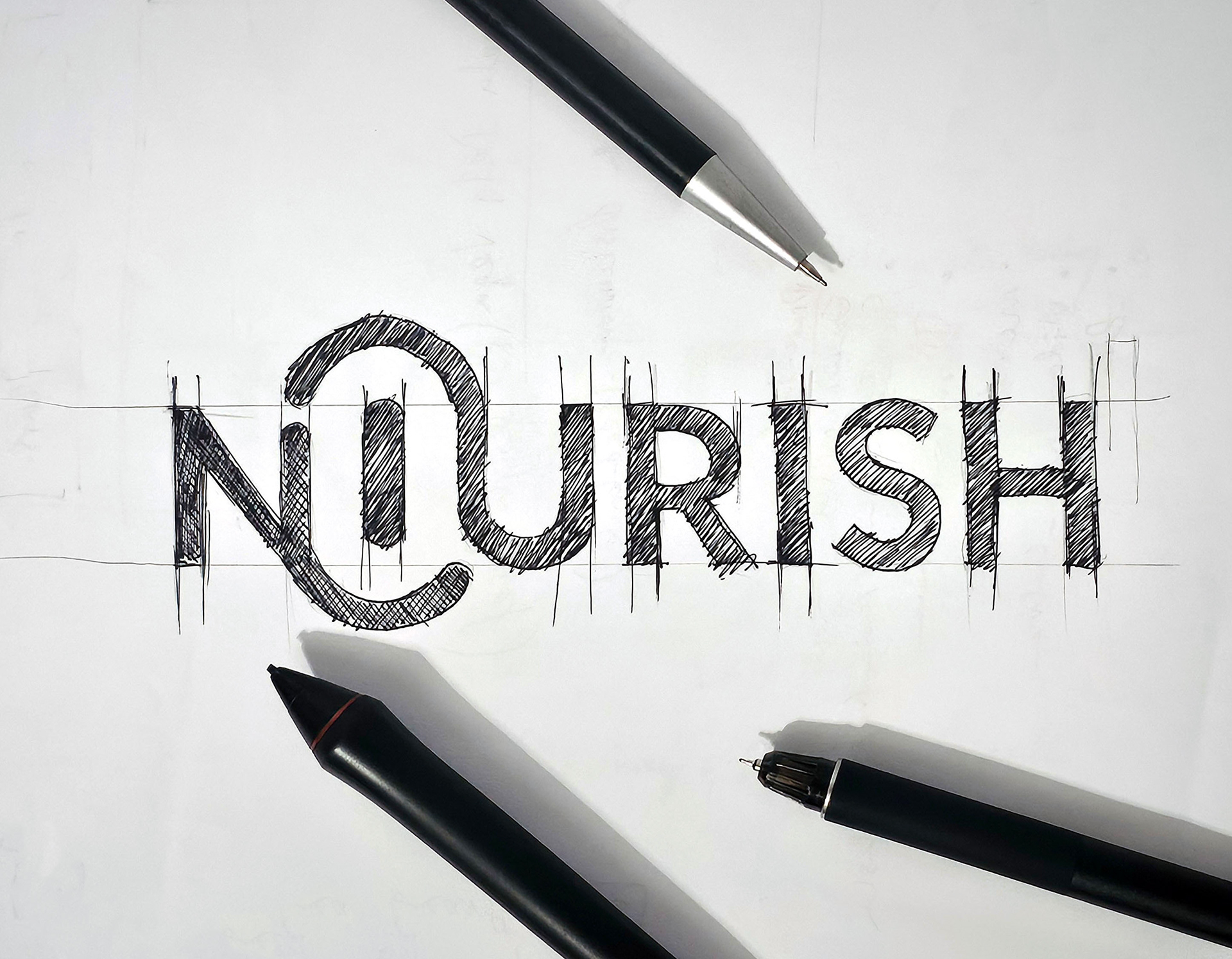
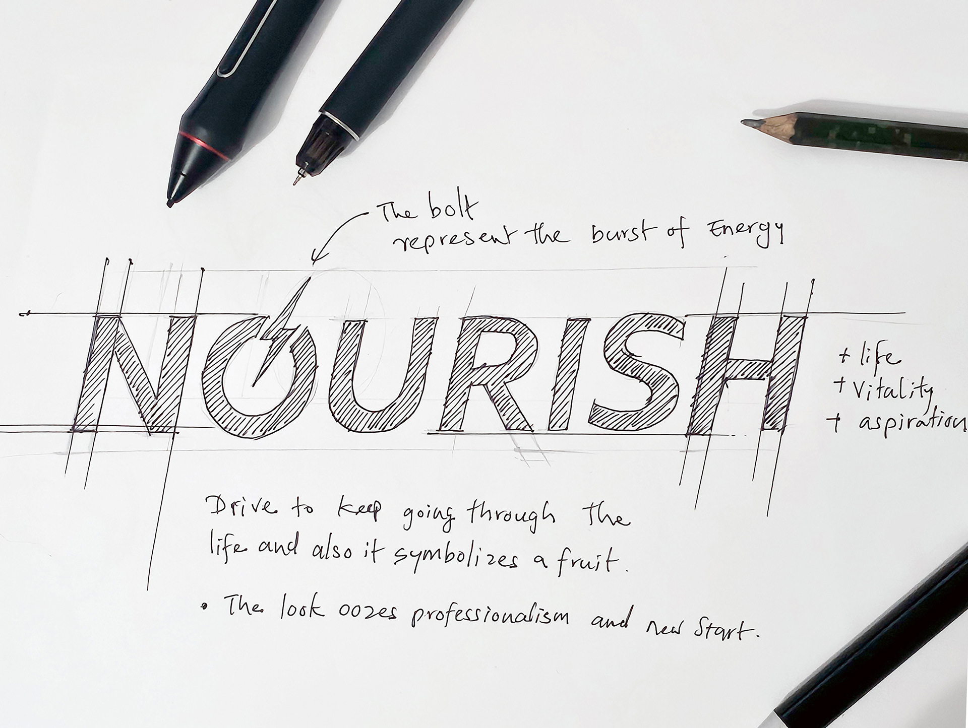
After going through several sketches and brainstorming sessions, the client has shown a preference for a logo that grabs attention and distinguishes their brand from others. They are looking for a simple yet powerful wordmark that effectively conveys a compelling message.
The final logo design captures the essence of the brand in a sophisticated, trustworthy, and visually captivating manner. It should encapsulate contemporary design elements while also exuding an enduring and classic charm.

NOURISH aims to establish a unique brand identity in a competitive market, distinct from conventional approaches. The objective is to revitalize the brand's assets and effectively communicate compelling stories with credibility, emphasizing the core message.

THANK YOU!